- 5 stars: 11 (100%)
- 4 stars: 0 (0%)
- 3 stars: 0 (0%)
- 2 stars: 0 (0%)
- 1 star: 0 (0%)
So good
Absolutely wonderful job by CTP for this production. The quality and development for a standard edition is equivalent to high end publications from other presses.
Wonderfully printed and designed. Superb illustrations, but I'm biased. ;)
Received my standard edition of Treasure Island. And of course there is nothing standard about it. I can feel the love that has gone into every aspect of it, and it automatically soared up among the top five most beautiful fine press books I now own. And there are many contenders for that spot in my library.
So far, I have seen all Conversation Tree Press editions published, and I was really looking forwards to receiving Treasure Island. Needless to say, when the Standard Edition arrived on my doorstep, and I opened the box - again I was floored by what I saw: Both the design and (quality of) the materials, plus the craftsmanship made this edition (Standard, really?? Could easily pass for a Deluxe) another instant CTP winner.
I for one cannot wait to see what will be next.
Conversion Tree Press out did themselves on this production. The reason for buying a CTP book is the quality, time and effort that they put in to producing the book. It's a pleasure to hold and read. They outdid themselves in the printing and the design decisions they made in this volume. The world would be a better place if everyone took such care and craftsmanship with books. I can't wait for the next book. I should mention that the book is impressive to look at and the letterpress printing means it's also impressive to the touch. It would make a great gift or someone else (or yourself).
This review is of the so-called "Standard Edition."
I'll begin by saying that this edition is anything but "standard," but since CTP is going with this designation, they are going to force other small presses to reconsider their definition of the word.
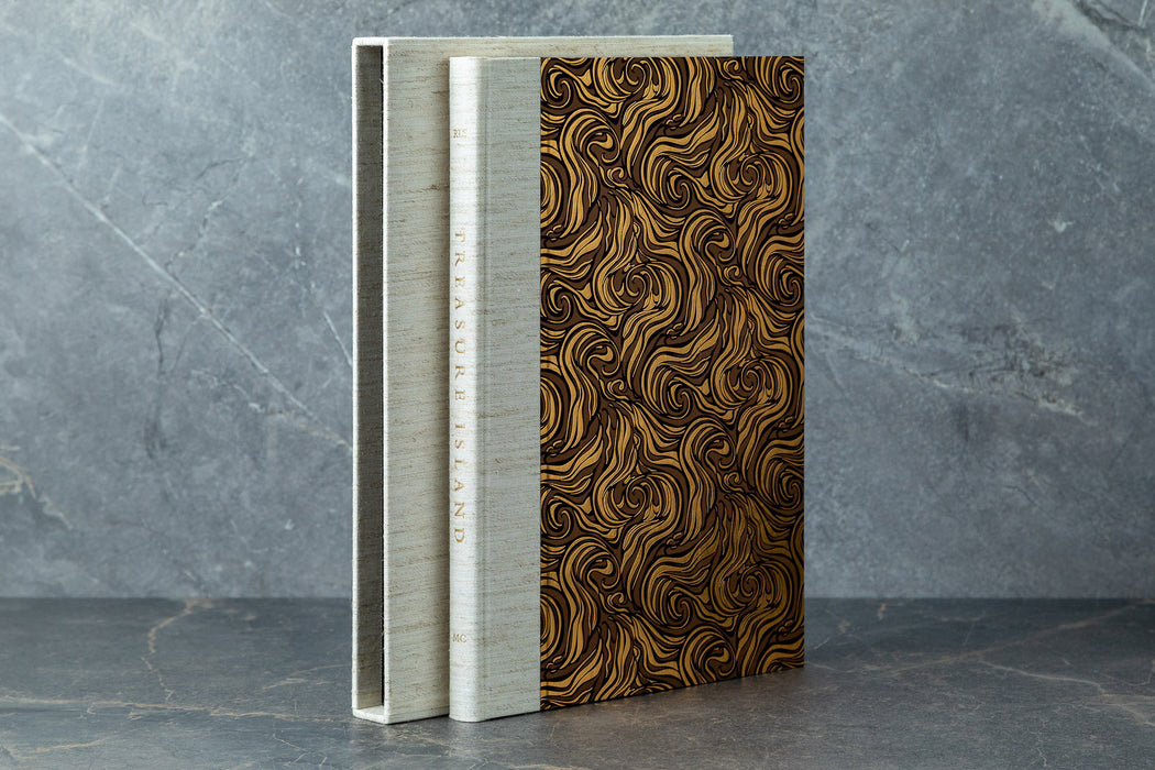
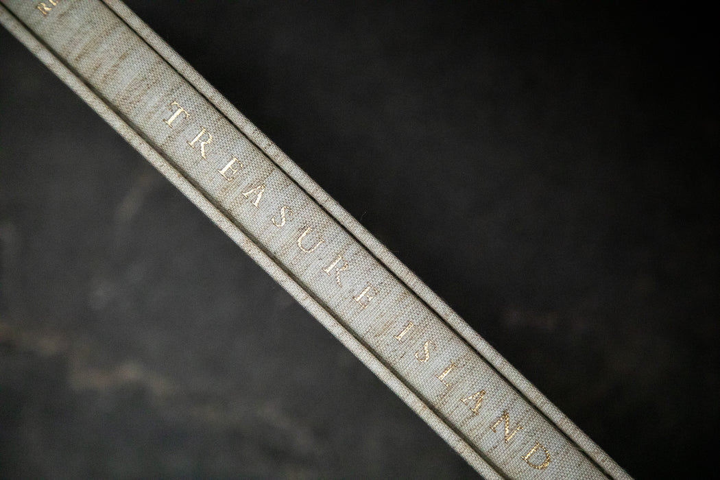
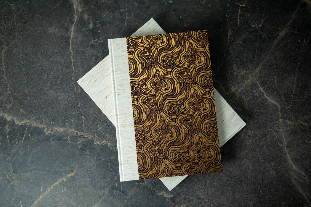
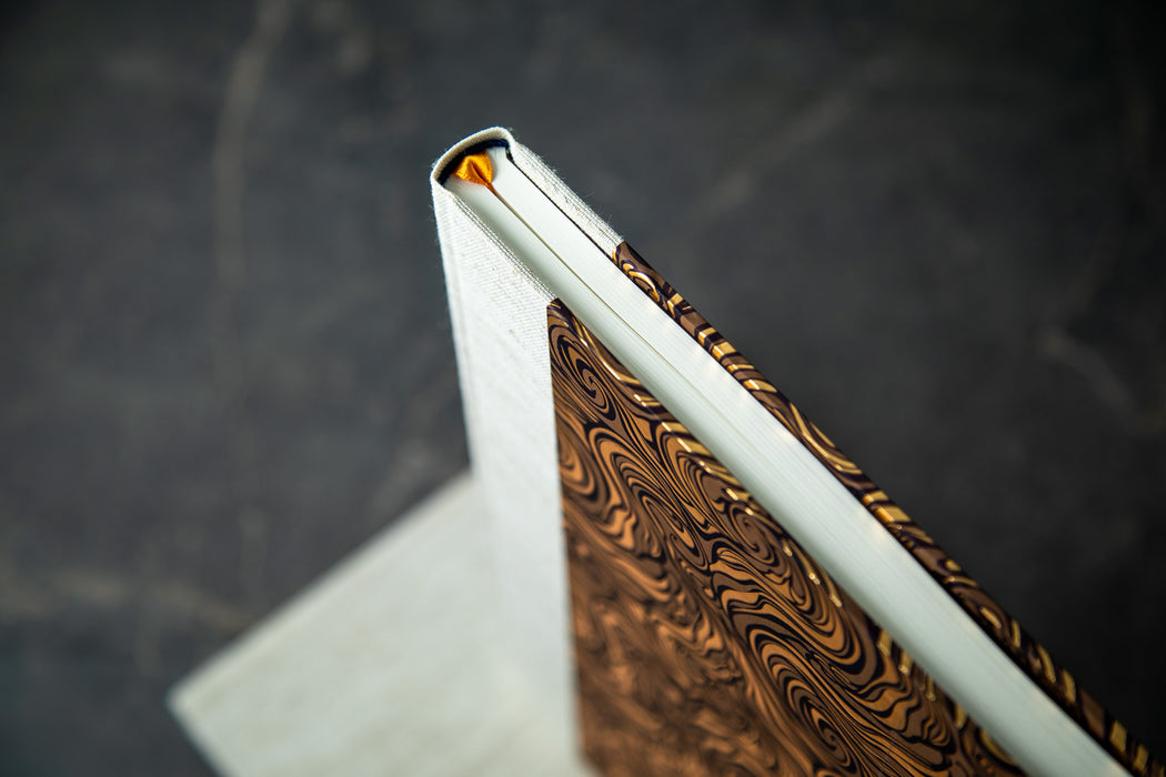
Between the premium, Italian cloth binding, and the letterpress printing, both within and without (the "decorative paper boards with swirls of brown and gold" are also letterpress printed), we are treated to high-end touches of the sort that many fine presses simply don't offer at this price point. The bar is being raised.
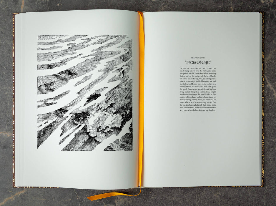
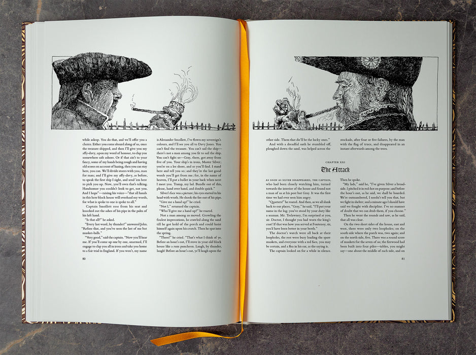
The design of this edition was thoughtfully and tastefully done. It is not always an easy task to please every reader/collector, but I found the book to be quite beautifully done, cover-to-cover. What stands out the most to me was the selection of Marc Castelli to provide the artwork, which was a pleasant surprise. I always like discovering new, talented artists, and his 52 illustrations bring this story to life quite well, with his talent on display throughout. Marc's selection was an excellent choice.
Another surprise -- since apparently I didn't read the pre-order description of the book very well -- was that of the three related essays by the author and the introduction by Dr. Caroline Howitt. Well played, CTP. Well played.
I'll finish with this. If I were forced to nitpick over some negatives about this edition, it would be the cost (well, maybe) and the size. At $345 (USD), this may be a bit pricey for the lowest cost edition of the three options available, as compared to other presses' "standard" offerings. However, the money was put to good use, with the superb materials, design, and printing clearly on display. As for the size, it is described as "oversized," and oh boy, is it! At 9.5" (inches) by 13.4" (inches), this is currently the second largest fine press book I now own. But did I mention that this is a nitpick? The size is really inconsequential to me, but it is something to note. I had to place this edition in a special location, front and center on my bookshelf, due to its height. Ah well, darn the bad luck! Because it looks beautiful resting there.
Keep up the excellent work, CTP.
wonderful edition!
One of the nicest limited editions that I own.
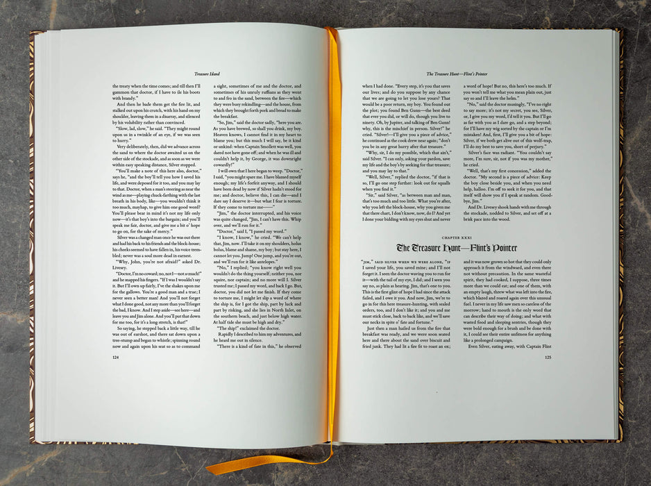
Your edition of Treasure Island has reintroduced me to a book I haven't read for probably sixty years, and I am delighted. Its design is perfectly apt, its typography discreet (as all good typography should be), the binding is handsome, and Pat Randle's printing is in the best traditions of fine press work. Marc Castelli's excellent pen and ink drawings, winding through the text, move the story along at a spanking rate, perfectly suitable to the pace of the reading.
Congratulations on a splendid piece of bookmaking!
I’m at a loss for words. This production rocketed to the top of my favorite pieces of art. The love and craftsmanship put into this work is apparent in every single aspect. CTP once again strikes gold!
Newsletter
Sign up to the newsletter to be among the first to know about new editions and news from the Press.