Illustrating Treasure Island
Marc Castelli is a maritime artist well known for his vibrant watercolours of the Chesapeake Bay and its watermen. For book illustrations, he prefers pen and ink line drawings, allowing him to capture an immense amount of detail in his own unique style. I came to know of his work through the Chester River Press edition of Joseph Conrad’s Heart of Darkness. Published over a decade ago and immediately hailed as a landmark, due in no small part to Marc’s contributions, its reputation has only continued to grow.
Despite the abundance of Treasure Island interpretations, we felt there was an opportunity to do something unique in creating an edition that embraces the story’s darker aspects: gritty, realistic, and willing to capture some of the more somber moments.
We collaborated closely over the course of a number of months and hundreds of emails, the result of which is 52 illustrations ranging in size from full page to decorative capitals. Many of them have been carefully integrated into the text with meticulous tweaking line by line, existing in harmony with the words on the page to create an immersive and visually cohesive reading experience.
The following is an excerpt from Marc’s notes on illustrating Treasure Island, included in full in all three states of our edition, followed by a number of single and double page spreads from the book.
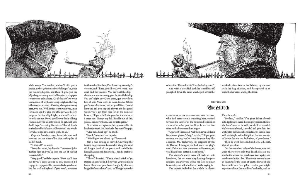
I jumped at the chance when Tony Geer asked if I would be interested in illustrating Treasure Island. Through a few exploratory emails it became apparent to me that he was not looking for the standard, “it’s been done before” imagery for a story that is actually quite dark with an amazing amount of physically violent death in it. I felt that using pen and ink for the illustrations without color would be more fitting with less room for comparison to others that came before.
The research for this project produced a volume of images researched from Google, my own library of books ranging from trees, sea life, photos of water, the construction of 18th century schooners to coracles. I learned that in the 18th century spy glasses were not articulated telescopes but very long tubes. From books by the gifted artist Wm. Gilkerson I learned about the clothes worn by ordinary able body seamen, about cutlasses, pistols, and from other books I learned about the many types of gold coins looted by Capt. Flint who buried the treasure on the island. The name of the schooner chartered by Squire Trelawney was named the Hispaniola. When researching Long John Silver’s parrot, Capt. Flint. I discovered a breed of Hispaniola parrots. What better pun to use than having Silver’s parrot be a Hispaniola parrot?
For the actual 18th century schooner I used a very fine replica, the Sultana, of such a vessel built here in Chestertown, Maryland as my model. I am fifteen volumes into illustrating her construction using pen and ink. I have several hundred pictures of the Sultana under sail, and they proved invaluable in depicting the Hispaniola. The home port of Bristol in the 18th century proved to be an amazing bit of research. There are many period documents illustrating the spectacular Avon Gorge and the city of Bristol. R. L. Stevenson’s penchant for anachronistic objects out of time proved to be an interesting challenge. His California vegetations and sea life need a dichotomous compromise between fact and narrative.


