Typesetting Treasure Island
I was introduced to Treasure Island as a child in the form of the Moby Books Illustrated Classic Edition. Small, abridged, and with illustrations on every other page, these books were a great way to not only begin reading more advanced books, they were a great introduction to a wide array of classic literature. Looking back, my passion for collecting probably began with my efforts to gather as many of these editions as I could.
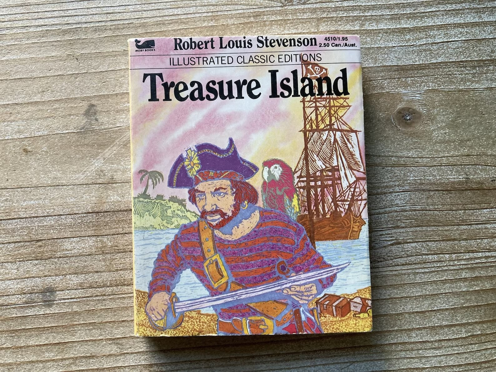
Treasure Island Illustrated Classic Edition from Moby Books via Etsy.
The Conversation Tree Press edition of Treasure Island is a quarto—four pages are letterpress-printed to each side of a sheet of paper approximately 20in by 28in, folded twice and then trimmed to yield four sheets (eight pages) each 6.7in by 9.5in.
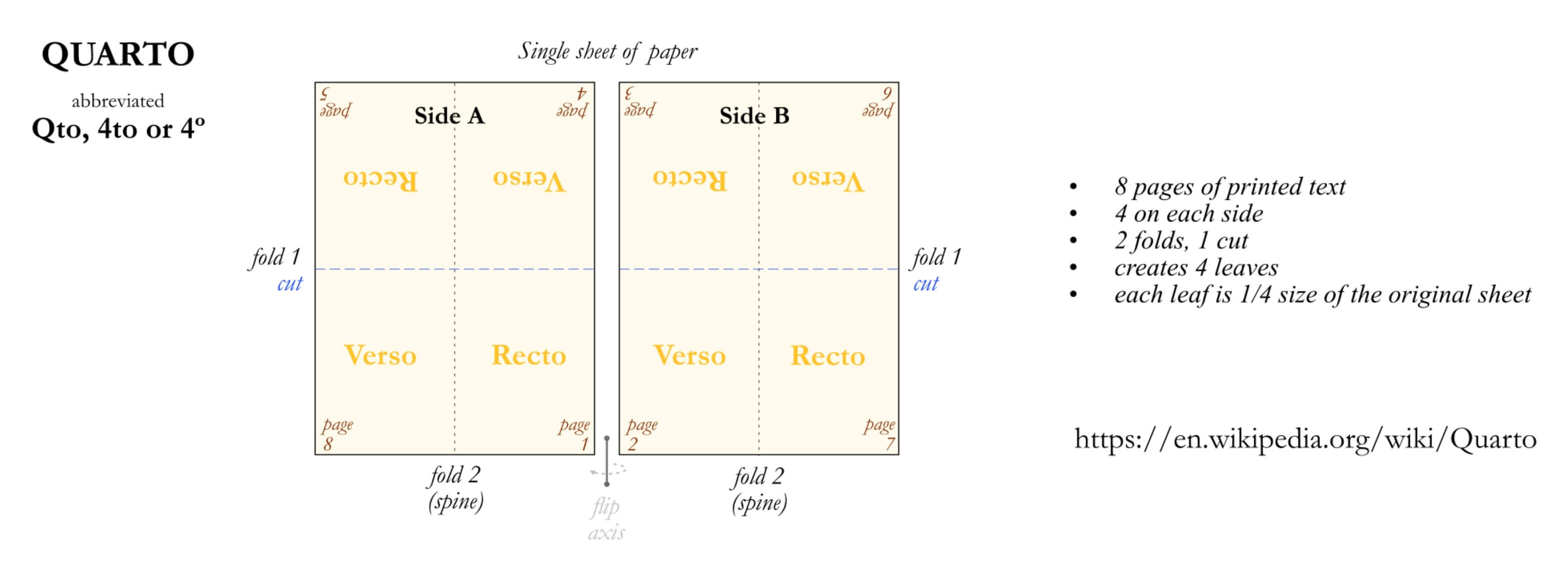
Quarto book image via Wikipedia.
The Van de Graaf Canon
The construction of the page is just as important as the typeface used, and my preference has been to start with the Van de Graaf canon, popularized by Jan Tschhold’s The Form of the Page.
Derived from observations of the design of medieval manuscripts, it is a system based on geometric proportions that helps determine the optimal size of the text area and margins on a page, ensuring the content is well-balanced and harmonious.
The generous margins provided by the canon is one of the reasons it works well—providing ample space to hold the book comfortably without covering the text while creating an inviting reading experience.
A Single Column
The first iteration of Treasure Island was set in a single column and followed the canon fairly closely, with the text was set in Bembo Book 14pt with 4pts of leading:
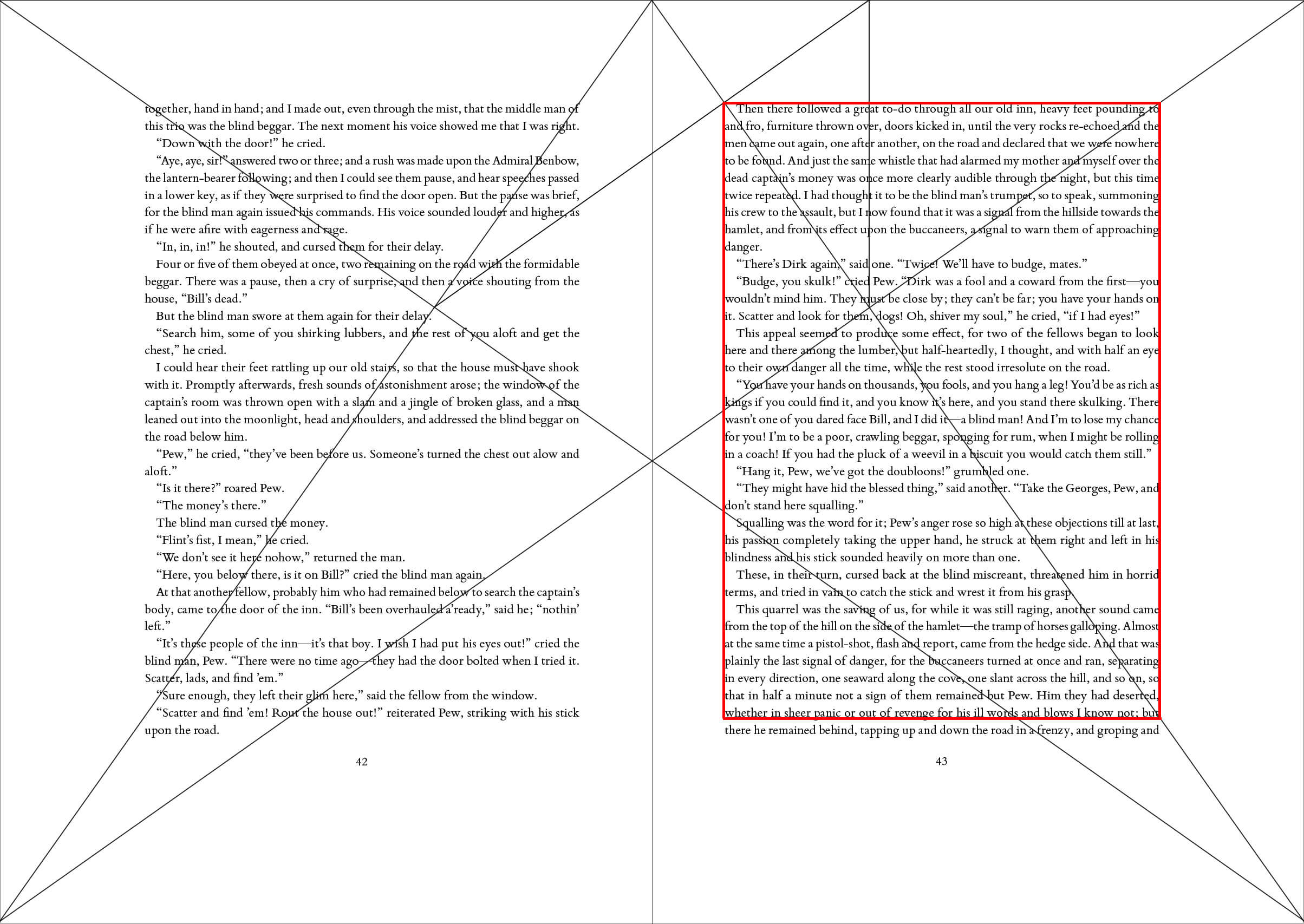
While a calculator is readily available to determine margin sizes, drawing the canon over the layout of the page reveals the outcome clearly. The red rectangle indicates where the text would be placed if the canon were followed exactly. In this case, I added another line to the page as the large trim size already yielded a generous margin.
Challenges with a single column
While the proportions of the page worked well enough, there were two challenges:
- There is a fair amount of dialogue in the book, and shorter lines created large gaps in the text, as illustrated above on page 42.
- Even with a larger font size of 14pt and generous margins, it was challenging to find the start of another line of text after reaching the end of the first one—the line length felt too long.
Robert Bringhurst’s seminal The Elements of Typographic Style advises that 45-75 characters per line (cpl) provides the optimal reading experience for a single column of text on a page set in a serif typeface at body copy size. In the English language, this corresponds to 7–12 words per line (wpl).
This obviously varies on the typeface used, personal preference, subject matter, reading ability, etc., but a random sampling of a number of pages showed this layout created 73cpl lines, just at the top of that limit, and 14wpl, exceeding it.
For a shorter text, this might have been okay, but over 220+ pages the reading experience would have suffered.
One way of addressing this would have been a combination of smaller margins and larger font sizes, but a quick adjustment to that effect didn’t yield a result that worked well for the book I was trying to create.
Two Columns
The other option, which felt like a natural fit for a book like Treasure Island, was splitting the page into two columns. Doing this allowed me to set the body text in 12pt with 2pts of leading, a font size commonly used when typesetting books, for good reason—it is eminently readable. A small adjustment to the margins made them 1.5in, 1in, 2.7in and 1.9in wide at the top, inside, bottom and outside respectively, and the columns of text 3in wide.
This setting yielded an average line length of 44.2cpl and 8.5wpl—within Bringhurst’s guideline, but more importantly, a better reading experience.
The shorter line lengths also make for a more "active" reading experience, allowing the reader to go through the text at what feels like a faster pace, suitable for an adventure book.
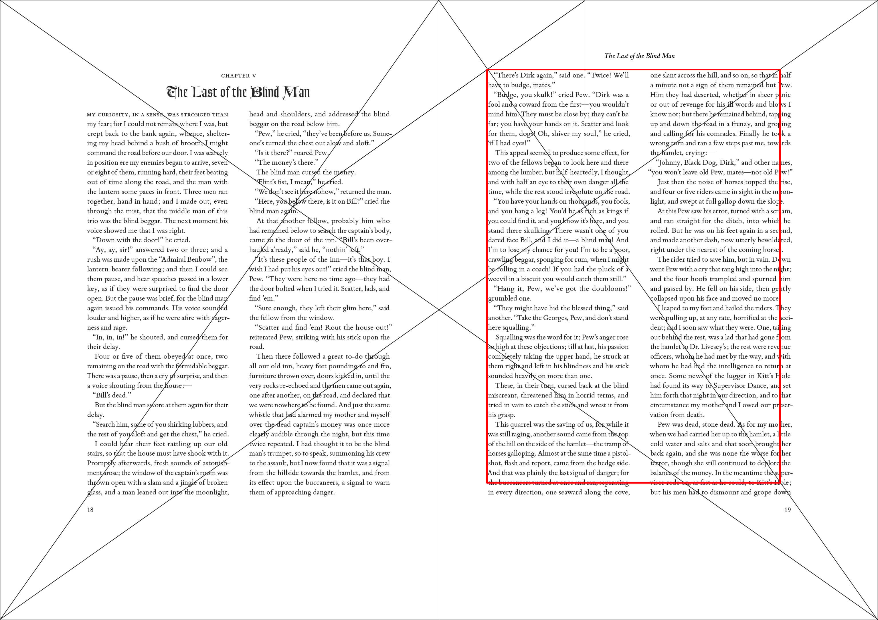
As you can see from the example above, this also addressed the issue with gaping holes in the text.
Additional Typographic Considerations
Robust Typeface Features
Bembo Book was chosen partly because of its robust typographic features, which include real small caps; ligatures; and tabular and oldstyle figures, all of which were needed and used throughout.
Chapter titles
Chapters don’t start on a new page as there are thirty-four of them and doing so would have created vast amounts of empty space throughout the book. Instead, new chapter headings span both columns, creating a clean and obvious break in the text.
Widows, orphans and runts
Avoiding widows and orphans required a great deal of attention and fine-tuning, especially with twice the number of columns. Avoiding runts (where the last line in a paragraph ends in a single word) with a shorter column width is almost impossible, but they also create less of a problem and eliminating them will often create more challenges than it solves.
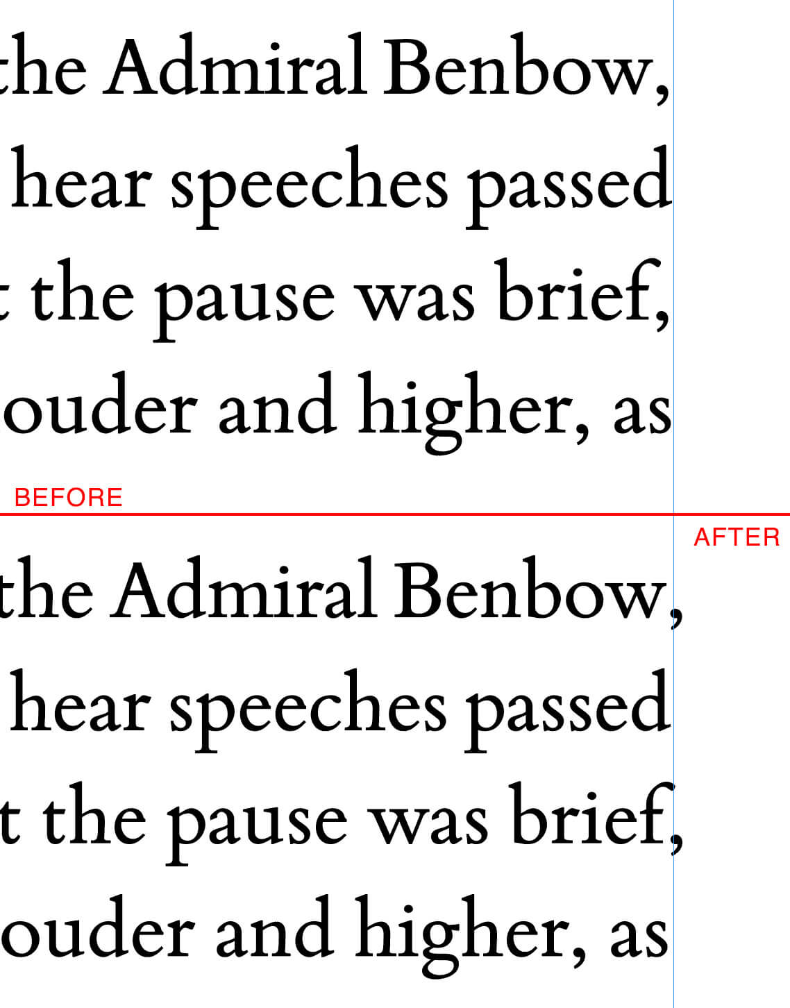
Optical Margin Alignment
Optical margin alignment, InDesign’s name for hanging punctuation, was also turned on to help establish the sides of the column, as shown in this example:
Illustrations
This layout created an opportunity for much more interesting integration with Marc’s illustrations, some of which I’ll show off in the next update.
Thanks to Marcelo Anciano at Arete Editions whose help in the final stages of typesetting helped to create a more polished book.