Printing Treasure Island
This is the third and final piece in a three-part series sharing some of the decisions and thinking behind our edition of Treasure Island. The first two were Typesetting Treasure Island and Illustrating Treasure Island.
Just a gentle reminder: the Kickstarter campaign ends in three days and I’ll be setting the limitation of the edition a few days after that. The remaining copies will then go up on the Conversation Tree Press website at a higher price.
Having decided on our approach to illustrating the edition, our thoughts turned to what form Marc’s illustrations would take. This was a decision that would directly impact the way we’d reproduce the artwork, how we would prepare it for that reproduction, and the and the ensuing time and cost.
Shaping the Page
The simplest form Marc’s artwork could take was to make every illustration full page. Doing it this way would have minimal, if any, impact on the text, allowing typesetting to move ahead and be completed independently of Marc’s work.
Another advantage is that it would have allowed us to print Marc’s artwork digitally and tip it into the book, with a comparatively short time spent on preparation. While we often do tip ins in our editions—Peter Pan, Faun, and Flowers for Algernon all had multiple tip ins—we reserve them for full colour artwork that cannot be printed letterpress.
However, while this would have been an efficient approach, it was divorced from the process of making the book. At Conversation Tree Press, not only do we include as much artwork as possible in every edition, we give careful thought to its form and placement. Having typesetting and illustration exist as two separate processes independently of each other is contrary to the type of book we make.
I also felt that it was a missed opportunity given the larger canvas size offered by the trim size. An adventure book deserves a reading experience that compliments the story, and the relationship between the words on the page and the illustrations are a key part of that.
As shown in the post about Illustrating Treasure Island, while we do have a number of full page illustrations (larger than even many broadsides) we chose to allow illustrations to evolve into organic shapes that interact and blend with the text, making them as crucial to the narrative as the words themselves.

Reproducing the Artwork
Knowing the artwork would weave through the next, and recognising there were many opportunities for illustration throughout the book, we had only two choices when it came to reproduction.
DIGITAL AND LETTERPRESS
Print the artwork digitally first, then print the text letterpress after. Doing it this way would give us the ability to resize Marc’s artwork if needed without worry while simplifying the preparation of each illustration. This option would be faster and cost less than the alternative. However, it meant the book would have a combination of both letterpress printing and digital printing.
LETTERPRESS THROUGHOUT
Print the entire book letterpress.
While printing the entire book letterpress introduces a number of challenges, this was more in line with our vision for the edition and we knew Nomad Letterpress would be more than capable.
Letterpress-printing the Illustrations
Some of the challenges faced when letterpress-printing line arwork.
ARTWORK PREPARATION
Letterpress printing is a form of relief printing with no shades of gray—the plates are either touching the paper and leaving an ink mark, or they’re not. To prepare the artwork for letterpress printing, Marc inked his pencil drawings and erased as much of the pencils as possible while being careful not to damage the paper. After scanning at a very high resolution, the artwork was further cleaned up to remove any remaining traces of pencils and repair any damaged paper, then converted to black and white. This GIF shows the inked drawing and the final artwork ready for print:

REDUCED FLEXIBILITY
There is a limit to how thin a line can be for it to be successfully made into a plate and printed letterpress. If it’s too thin it simply won’t make it onto the plate, and won’t be printed.
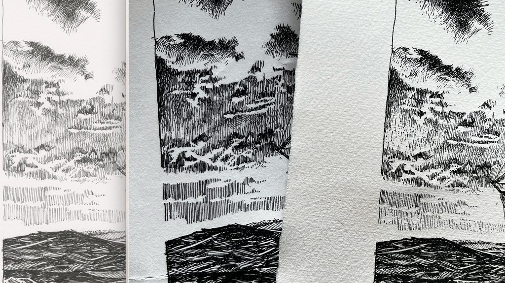
This is perfectly illustrated below by the proofs we ran:
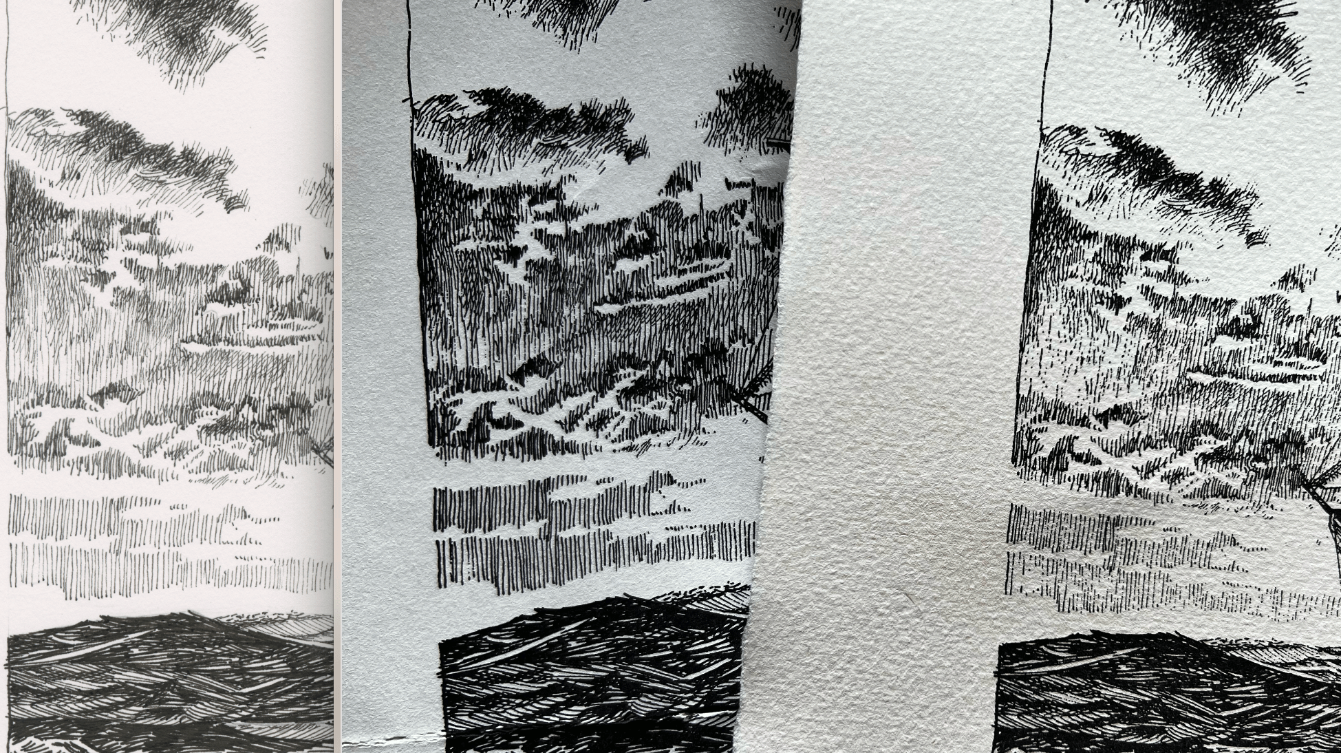
From left to right is a scan of Marc’s original inked illustration, a proof printed at the original size, and a proof printed from an illustration that was reduced in scale. As shown, the illustration that was scaled down has lost detail, while the one printed at the original size retained all details.
While scaling up an illustration wouldn’t lose any detail when printed, it would mean the size of each stroke of the pen was being reproduced larger than originally drawn. Our intention was to faithfully reproduce the artwork in this edition, so all of the artwork is printed at the original size drawn by Marc..
MULTIPLE RUNS THROUGH THE PRESS
When letterpress printing, just the right amount of ink on the roller is required to produce sharp text—too much and it becomes blotchy, too little and definition is lost.
On the other hand, illustrations, often with large areas of black, require more ink on the roller to ensure dark, even ink coverage across the entire surface. In cases like this, the sheet goes through the press twice—the first time to print the text, and the second to print the artwork.
Our proofing tests so far have shown that the majority of illustrations necessitate a second run through the press, so we’ve allowed for three months of printing in our schedule.
Bringing it All Together
We’ve been at work on Treasure Island for almost two years, and along the way we were faced with many options. In the end, we decided to make the best book we possibly could—lavishly illustrated, artwork that exists in harmony with the text, letterpress-printed from the first page to the last, meticulously typeset, and beautifully bound. It’s not the fastest way of making a book, not the easiest way of doing it, and certainly not the least expensive way. There are many ways to make a book, but this is the way we needed to make ours—without compromise.
To everyone who’s pre-ordered a copy or backed the project at any tier—thank you for giving us the opportunity to make that happen.